Color distinguishes our brand and helps us create consistent experiences across our services and user experience with us.
We use focused, meaningful colour to pin-point exactly what people need to see whilst being in-line with our branding.
Colour Palette
Our visual identity is the culmination of our brand personality. Colour plays a really large part of our visual identity, as the rest of our branding is quite minimal.
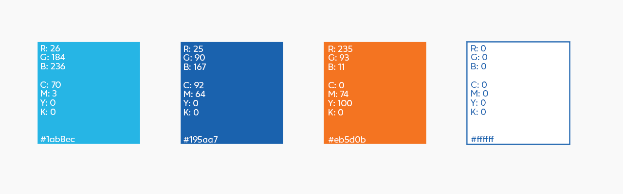
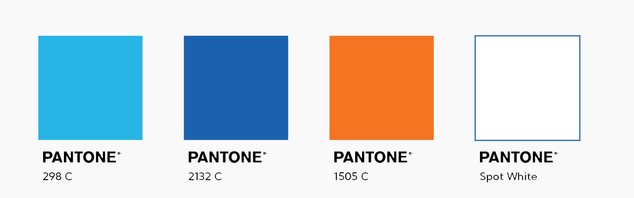
Our colour palette is comprised of white, blue, cyan and orange. These colours all represent different aspects of our personality. The blue and cyan to highlight the main connotation of blue as water, as well as representing the gentle caregiver. The white is is for our knowledgeable sage and a splash of orange to convey the playful jester part of our personality.
These colours are used in logical ways throughout our design to guide the audience’s eye, highlight and differentiate important bits of information.
These colours just so happen to be the same colours on our teacher tops because or visual identity is born from that experience in the pool. These colours come together to form our wave, the icon that flows across everything we do.
We use focused, meaningful color to pinpoint exactly what people need to see. We are committed to complying with the Web Content Accessibility Guidelines AA standard contrast ratios. To do this, we only use primary and secondary colors that support usability by ensuring sufficient color contrast between elements so that people with low vision can see and use our products.
Primary Colours
White will always be the main colour keeping the brand clean and simple. Followed by our two shades of blue, with just a splash of orange for that playful touch.
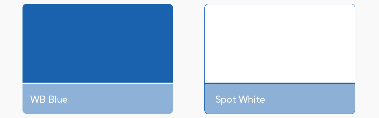
Blue and white are used as our main colours when creating design. Our logo is very clean and only consists of these two colours.
Accent Colours
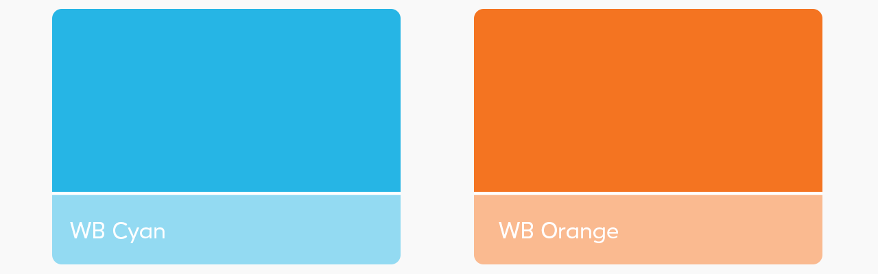
Our Accent colours are Cyan and Orange, which are used to add dimension to our two primary colours, increase engagement and add that little splash of fun.
Cyan is our first accent colour, which should be used for sub-headings and as a first option when introducing more levels to differentiate text, sections and imagery.
Orange is to be used more sparingly: as a light fun dash it really pops against the counter tones of the blue. Orange highlights smaller, more important sections of information. Quotes, call to action buttons and to highlight our website within contact details.
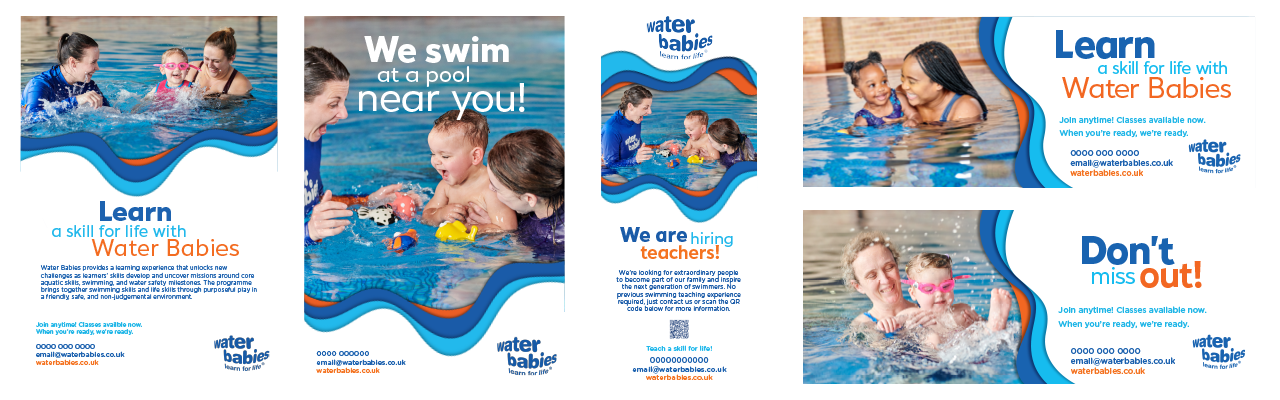
The proportion of on design work for our brand should be mainly based around having white and blue as our sole focus. The image below visually displays the proportions of colour distributed throughout the brand.